
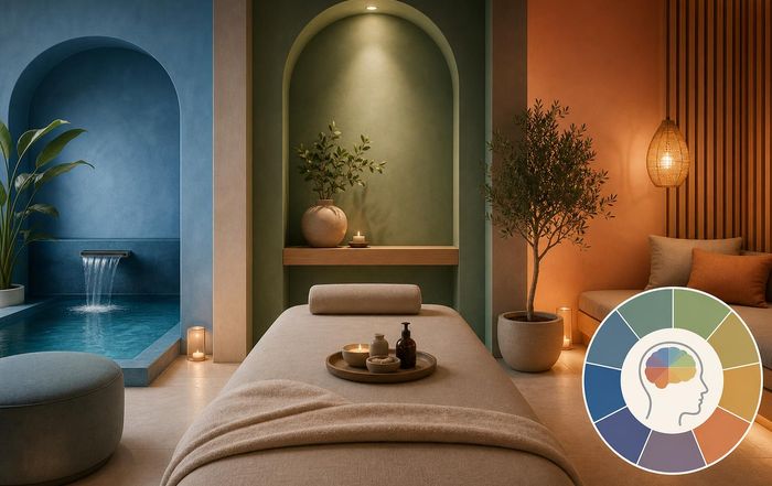
The Psychology of Color in Spa Design: How Hues Shape Guest Experience
Color as a Strategic Asset in Modern Spa Environments
Color is no longer treated as a purely aesthetic choice in spa and salon environments; it has become a strategic asset that influences guest emotions, perceived value, brand trust, and even health outcomes. As wellness continues to evolve into a global, multi-trillion-dollar industry, leading operators across the United States, Europe, Asia, and beyond are turning to evidence-based color psychology to differentiate their spaces, deepen client loyalty, and align with the holistic wellbeing expectations of today's sophisticated clientele. For QikSpa, which speaks to audiences interested in spa and salon experiences, health, wellness, beauty, food and nutrition, fitness, yoga, fashion, travel, careers, business, and sustainable living, understanding the psychology of color is central to creating environments that are not only visually compelling but also therapeutically effective and commercially successful.
Decades of research into environmental psychology have shown that color can affect mood, stress levels, cognitive performance, and even physiological responses such as heart rate and blood pressure, making it a critical design variable in spaces intended for relaxation, rejuvenation, and transformation. Organizations such as the American Psychological Association discuss how environmental cues shape emotional states and behavior, and color consistently emerges as a powerful, if often subconscious, influence in these analyses. In the spa context, where guests seek refuge from overstimulating urban environments and digital fatigue, the palette chosen for treatment rooms, lounges, reception areas, and wellness zones can either amplify or undermine the intended therapeutic effect.
As we continue to curate daily top content for discerning readers across spa and salon, health, and wellness categories, the psychology of color in spa design provides a powerful lens through which to understand how physical spaces can be designed to support mental clarity, emotional balance, and long-term wellbeing.
The Science Behind Color Perception and Emotional Response
Color perception begins as a physiological process, with wavelengths of light interpreted by the human visual system, but it quickly becomes psychological and cultural, shaped by individual experiences, social norms, and learned associations. Research summarized by institutions such as Harvard Medical School and Mayo Clinic highlights that light and color can influence circadian rhythms, mood regulation, and even sleep quality, which are all central to the restorative promise of spa environments. In wellness-focused interiors, this interplay between biology and psychology must be handled with precision, as even subtle shifts in hue or saturation can change how a space feels and how long guests wish to remain there.
Warm colors such as reds, oranges, and yellows are generally associated with stimulation, energy, and social engagement, whereas cool colors such as blues and greens tend to evoke calm, stability, and introspection. Yet, these broad categories mask a more nuanced reality. A soft, desaturated terracotta can feel grounding and nurturing, while a highly saturated red may increase arousal, making it unsuitable for deep relaxation zones but potentially valuable in spa fitness studios or wellness cafés. Studies referenced by organizations like the Color Marketing Group and guidelines from the WELL Building Standard illustrate that the intensity and context of color are as important as the hue itself, particularly in environments dedicated to health and wellness.
For our readers who follow beauty, fitness, and lifestyle trends, understanding these subtleties helps explain why some spas feel instantly soothing while others, despite luxurious finishes, can feel visually noisy or emotionally unsettling. The most successful spa operators in markets from the United States to Japan increasingly collaborate with color consultants and environmental psychologists to ensure that every chromatic decision supports a coherent emotional journey.
Core Color Families and Their Role in Spa Design
Within spa and salon environments, certain color families recur because they align well with the psychological goals of relaxation, rejuvenation, and subtle sensory engagement. Each family carries distinct emotional connotations and design implications, and their effectiveness often depends on how they are combined, layered, and illuminated.
Blue remains one of the most widely used hues in spa design because of its strong association with water, sky, and open horizons, all of which convey calm and expansiveness. Lighter blues, reminiscent of coastal environments, tend to lower perceived stress and support contemplative states, making them ideal for hydrotherapy zones, relaxation lounges, and meditation rooms. Darker, deeper blues, when used sparingly, can add a sense of depth and luxury but must be balanced carefully to avoid creating spaces that feel too somber or enclosed.
Green, closely linked to nature and biophilic design principles, has become a cornerstone of contemporary wellness interiors. Research shared by Terrapin Bright Green and similar organizations demonstrates that nature-inspired palettes can reduce stress and enhance cognitive function, supporting the growing emphasis on mental health within the spa sector. Soft sage, muted olive, and moss tones are particularly effective in treatment rooms and yoga studios, where they suggest organic calm and continuity with the natural world. These hues pair well with natural materials such as wood and stone, reinforcing the connection between color and tactile experience.
Neutrals, including warm whites, beiges, taupes, and soft greys, serve as the foundation of many spa palettes because they provide visual rest and allow accent colors, textures, and lighting to take center stage. However, as experts at Pantone and leading design consultancies emphasize, not all neutrals are equal; the undertone of a neutral-whether warm or cool-can dramatically alter how a space feels. Warm neutrals tend to feel more inviting and human-centric, while cooler greys can appear sleek but, if overused, risk feeling clinical or emotionally distant. For QikSpa's global audience, this distinction is particularly relevant as cultural expectations differ between markets such as Scandinavia, where minimalist cool palettes are common, and Mediterranean regions, where warmer tones are often preferred.
Soft pinks and blush tones have also emerged as important players in spa and salon design, especially in beauty-focused environments and women-centric spaces. When used with restraint, these hues can convey warmth, care, and subtle luxury, aligning with the emotional needs of guests seeking personalized attention and nurturing touch. Organizations like Dove and Estée Lauder have leveraged these tones in branding to signal softness and self-care, and similar principles translate into interior environments where guests are invited to slow down and reconnect with themselves.
Cultural Nuances in Color Meaning Across Regions
For spa brands operating in multiple countries or catering to international guests, color choices must account for cultural variations in meaning and preference. While certain associations, such as blue with calm and green with nature, are relatively widespread, others are highly context-dependent. In many Western markets, white is associated with purity and cleanliness, making it a staple in spa and medical spa design, whereas in some Asian cultures, white can be linked to mourning, suggesting that an all-white environment might not evoke the desired emotional response.
Red illustrates this complexity particularly well. In China and other parts of Asia, red is associated with luck, prosperity, and celebration, making it powerful for branding and accent details, especially in festive or ceremonial contexts. In contrast, in some Western spa settings, strong red may be perceived as overly stimulating or even aggressive, better suited to fitness zones than to relaxation suites. Resources such as The British Psychological Society and cross-cultural design studies published by MIT and Stanford University explore these divergent meanings, offering valuable guidance for international spa operators seeking to create spaces that feel both locally resonant and globally coherent.
For QikSpa, which engages readers across regions including the United States, United Kingdom, Germany, Canada, Australia, France, Italy, Spain, the Netherlands, Switzerland, China, Japan, South Korea, Singapore, Thailand, and beyond, this cultural sensitivity is essential. Spa owners and designers must balance a consistent brand identity with localized color accents that respect regional symbolism and expectations. A brand might maintain a core palette of soft neutrals and greens for global recognition, while adapting accent colors-such as gold in Middle Eastern markets or indigo in Japan-to align with local aesthetics and traditions.
Color, Lighting, and Materiality: A Holistic Design Equation
Color in spa design cannot be considered in isolation; it interacts dynamically with lighting, materials, and spatial proportions. Natural light, in particular, can dramatically shift the appearance of colors throughout the day, while artificial lighting technologies, such as tunable white LEDs, allow designers to modulate color temperature to support circadian health and mood regulation. Organizations like the International WELL Building Institute and Illuminating Engineering Society highlight that the integration of color and light has direct implications for wellbeing, especially in environments where guests may spend several hours in semi-enclosed spaces.
In treatment rooms, a warmer color temperature in the lighting can enhance the softness of creams, beiges, and blush tones, creating a cocooning effect that supports relaxation. In contrast, cooler light may be more appropriate in manicure, hair, or skincare consultation zones where precision and color accuracy are important. Spa designers increasingly specify finishes with low gloss levels to reduce glare and visual fatigue, allowing colors to appear richer and more stable under varying lighting conditions.
Materiality further shapes how color is perceived and felt. Natural woods, linen, stone, and clay-based finishes tend to soften and diffuse color, reinforcing biophilic design principles and enhancing tactile comfort. Synthetic high-gloss surfaces, while sometimes necessary for hygiene or durability, can make colors appear harsher and less forgiving, which may be at odds with the emotional tone many spas seek to convey. QikSpa's focus on sustainable and wellness content aligns with a growing industry shift toward eco-conscious materials that support both environmental responsibility and sensory wellbeing.
Zoning the Spa Experience Through Color
One of the most powerful applications of color psychology in spa design is the creation of distinct zones that guide guests intuitively through different stages of their visit, from arrival and orientation to treatment, reflection, and re-entry into everyday life. Rather than relying on signage alone, color can subtly signal function, mood, and behavioral expectations in each area, supporting a seamless and coherent guest journey.
Reception and retail areas often benefit from slightly higher energy levels and visual interest, as these zones must support both welcome and commercial activity. Here, a palette that combines calm neutrals with carefully chosen accent colors-such as muted teal, soft coral, or warm gold-can create a sense of approachable sophistication. This approach aligns with research from McKinsey & Company and Deloitte on experiential retail, which underscores the importance of emotional engagement in driving both satisfaction and spending.
Transition corridors and pre-treatment lounges, by contrast, should gradually dial down stimulation, using cooler, softer hues and more diffuse lighting to signal a shift from social interaction to introspective calm. Treatment rooms typically employ the most subdued palettes, favoring low-contrast schemes that minimize visual noise and allow guests to focus inward. Post-treatment areas, such as tea lounges or quiet terraces, may reintroduce gentle color variation-perhaps through textiles, art, or planting-to support reawakening and social reconnection without abrupt sensory shock.
For QikSpa readers exploring travel and international spa experiences, this zoning strategy is increasingly visible in leading properties across Europe, Asia, and North America. High-performing spa brands use color not only as decoration but as a narrative thread that carries guests through a carefully choreographed wellbeing journey.
Color and Brand Identity in the Spa and Salon Sector
In an increasingly competitive wellness landscape, color is also a key vehicle for brand differentiation and memorability. From boutique urban spas in London and New York to destination retreats in Thailand and New Zealand, successful operators treat color as part of a broader sensory identity that encompasses logo design, digital presence, uniforms, product packaging, and interior environments. Branding experts at organizations such as Interbrand and Landor & Fitch emphasize that consistent color use can significantly increase brand recognition and perceived reliability, which are vital attributes in a sector built on trust and intimate personal care.
For spa and salon brands, this means articulating a color strategy that reflects their core values and target audience. A medically oriented wellness clinic may lean into clean, cool palettes with precise accents that suggest clinical competence and innovation, drawing on cues from institutions like Cleveland Clinic or Mayo Clinic. A holistic retreat focused on yoga, meditation, and plant-based nutrition might instead emphasize earthy greens, soft terracottas, and hand-crafted textures, echoing the aesthetic language of conscious living and slow travel.
As QikSpa continues to serve readers interested in business, careers, and entrepreneurial opportunities in the wellness sector, the strategic use of color in brand building becomes a critical topic. A well-defined palette, grounded in psychological insight and cultural awareness, can help emerging spa brands stand out in crowded markets while conveying the credibility and professionalism that discerning clients demand.
Integrating Color with Wellness Modalities: From Yoga to Nutrition
Beyond the physical environment, color also intersects with the modalities and services offered within spa and wellness spaces, shaping how guests perceive and engage with different programs. In yoga studios, for example, color choices can support specific practice intentions. Gentle restorative and yin sessions may be best supported by soft, cool palettes and dimmable warm lighting, whereas more dynamic vinyasa or fitness-oriented classes might benefit from slightly more saturated, energizing accents. Guidance from organizations such as Yoga Alliance and research into mindfulness environments suggest that visual simplicity and harmonic color relationships can enhance focus and reduce distraction.
Nutrition and spa cuisine zones present another opportunity to align color psychology with wellbeing goals. Dining or refreshment areas that emphasize fresh, plant-rich menus often incorporate greens, natural wood tones, and daylight to underline the message of vitality and balance, echoing recommendations from World Health Organization and Harvard T.H. Chan School of Public Health on healthy eating environments. Colorful yet harmonious tableware and accent décor can subtly encourage guests to savor their meals mindfully, reinforcing the connection between sensory pleasure and long-term health.
For QikSpa, whose editorial scope includes food and nutrition and yoga, exploring these intersections underscores a core principle: color is not an isolated design decision but a cross-cutting element that supports the overall wellbeing proposition of the spa. When the chromatic language of treatment rooms, movement studios, relaxation lounges, and dining spaces is coherent and intentional, guests are more likely to experience the visit as a unified, meaningful journey rather than a series of disconnected services.
Sustainability, Ethics, and the Future of Color in Spa Design
As sustainability and ethical responsibility move to the forefront of consumer expectations, especially among women and younger demographics, the conversation about color in spa design increasingly extends beyond aesthetics and psychology to include environmental and social impact. Low-VOC paints, natural pigments, and responsibly sourced materials are now central to many design briefs, reflecting guidelines from organizations such as the U.S. Green Building Council and BREEAM. These choices not only reduce environmental footprint but also contribute to indoor air quality and occupant health, reinforcing the credibility of wellness claims.
Color trends themselves are evolving in response to this shift. Earth-derived hues, botanical greens, ocean blues, and mineral-inspired neutrals communicate alignment with nature and ecological awareness, resonating with guests who expect their wellness experiences to be consistent with their values. For QikSpa, whose readers are increasingly attuned to sustainable living and global wellbeing, this alignment between color, ethics, and brand promise is a key marker of authenticity.
Looking ahead, advances in materials science and smart lighting are likely to expand the possibilities for responsive, personalized color environments in spas. Dynamic lighting systems that adjust color temperature and intensity according to time of day, guest preference, or treatment protocol are already in use in pioneering facilities, informed by research from institutions like MIT Media Lab and Fraunhofer Institute. As these technologies mature and become more accessible, spa designers will be able to create spaces that adapt chromatically to support circadian health, emotional regulation, and individualized experiences, further blurring the line between design and therapy.
Positioning Us at the Intersection of Design, Science, and Wellbeing :)
In 2026, the psychology of color in spa design sits at the intersection of neuroscience, cultural studies, sustainability, and brand strategy. For QikSpa, which serves a global audience seeking insight into spa and salon innovation, health, wellness, beauty, fitness, travel, and careers, this topic encapsulates many of the themes that define the contemporary wellness landscape: evidence-based practice, cross-cultural sensitivity, ethical responsibility, and experiential excellence.
By exploring how color shapes guest emotions, behaviors, and perceptions of value, we aim to support spa owners, designers, therapists, and hospitality leaders in making more informed, human-centered decisions about their environments. Readers who are considering launching or evolving spa concepts can draw on these principles to craft spaces that are not only visually compelling but also psychologically coherent and aligned with the deeper aspirations of their clientele. Those interested in broader lifestyle and wellbeing trends can see how the colors that surround them in spas, salons, yoga studios, and wellness retreats are part of a larger narrative about how design can support healthier, more meaningful lives.
As the industry continues to evolve across North America, Europe, Asia, Africa, and South America, color will remain a powerful, if often silent, partner in the creation of restorative sanctuaries. Through ongoing coverage across spa and salon, health, wellness, and lifestyle topics, so this site is positioned to help both professionals and enthusiasts navigate this chromatic landscape with clarity, confidence, and a renewed appreciation for the subtle ways in which design shapes wellbeing.
